Separate Mobile Site or a Responsive Site?
Posted on May 25, 2014
By Gary Oosterhuis, Strategic Partner
Before we settle this topic, lets first discuss the difference between mobile sites and responsive sites.
A mobile website is a website that is specifically designed for mobile phones. It tends to contain less pages than the main site and usually offers resources specific to someone who is on the go. This visitor is most likely looking to find your location or phone number. They may also be interested in your products and services so don’t limit the contents of your mobile site to just a phone number and contact info.
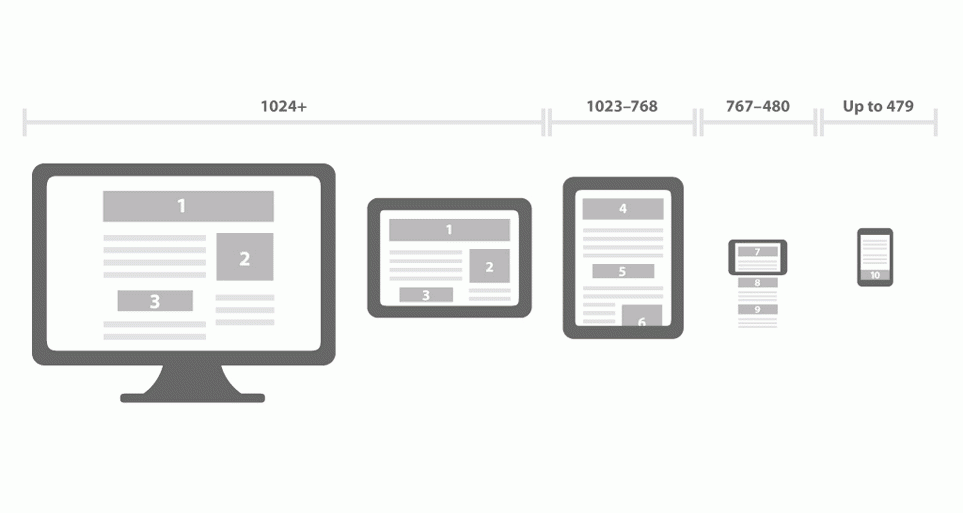
A responsive site is a single website that appears differently to each visitor based on the size of the device they’re using. During the development of a responsive website, specific rules are written that say ‘if the screen is less than X, display these elements this way’. Depending on the target market and the development budget, rules can be set for many different device sizes or just a few. Some common sizes to handle a phone displayed in portrait mode as well as landscape, a table displayed in portrait mode as well as landscape, and a desktop computer. The key thing to keep in mind with a responsive website is that elements can change size, get replaced, moved to another location of the page, or be removed altogether, all dependent on the size of the visitors screen. For example, a large sliding banner looks great in a desktop computer, but takes up far too much space on a mobile site. The sliding banner could be replaced with a smaller graphic, or removed altogether.
I prefer responsive over mobile, simply because the amount of work involved is practically the same and you can have a site that looks great on any platform.
Responsive websites are able to offer everything that a separate mobile site can offer and so much more. The time it takes to make a website responsive is equal to the amount of time it would take to develop a mobile website. Furthermore, it is less time consuming to maintain a single responsive site than it is to develop a full website and a mobile website.
I prefer responsive over mobile, simply because the amount of work involved is practically the same and you can have a site that looks great on any platform.
See how CS Designworks' and strategic partner Leyko Creative's expertise and creativity shine in this responsive site design for Eleven80 Rentals by visiting http://www.eleven80rentals.com.

Join Our Blog Community
@CSDesignworks
