11 Web Design Blunders
Posted on August 10, 2016
By Theresa Chiechi, Designer, Illustrator, Writer
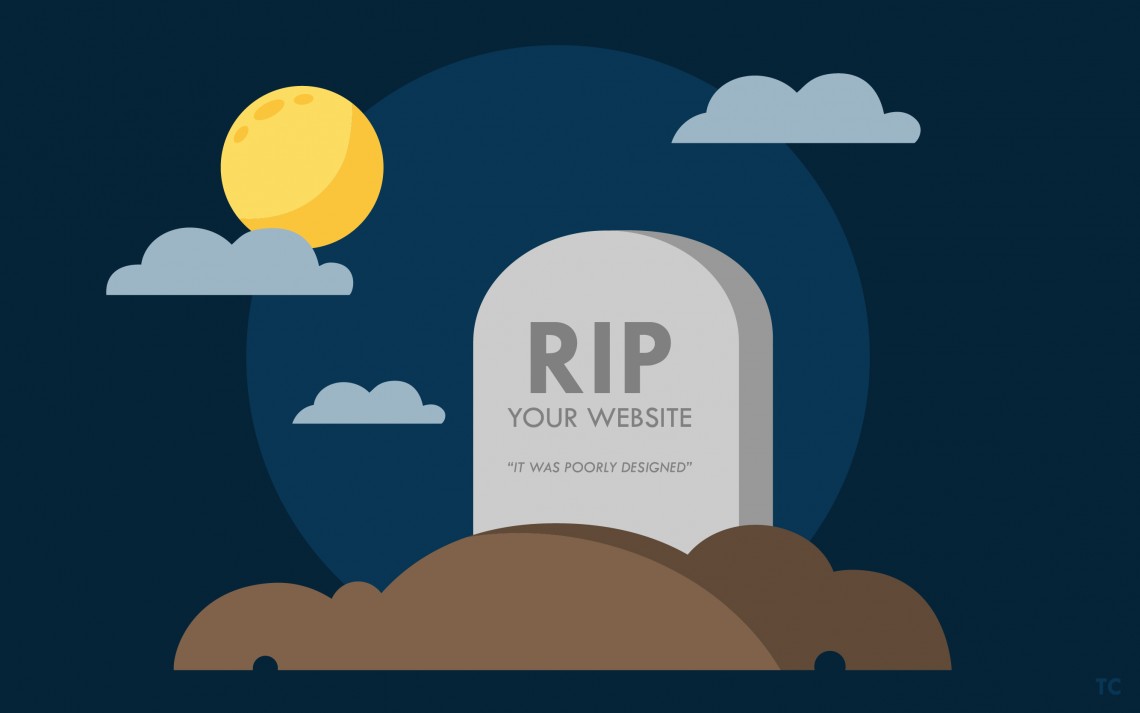
11 Website Deadly Don’ts
Your website is the ultimate representation of your company; it is the first impression, the mascot, and the portal that leads costumers to purchasing your service. A very important part of business, having a website that is both beautifully designed and easy to use can be a challenge. Especially with so much competition out there nowadays, it should be top priority to have the best website you can manage. Unfortunately there is a lot of room for error, so proceed with caution. Here is our top 11 list of website blunders to avoid.
1) Contact Info That is M.I.A.
Having a shopper visit your website and actually decide to use your services only to be unable to find any contact information is like going on a really awesome date, seeing a potential future with this suitor, and not getting a number at the end of the date. It’s disappointing and frustrating. Don’t be a tease; if you offer a really great product or service you best have a way for the visitor to have a way to contact you otherwise you might as well just not have a website.
2) Carbon Copy Website
Today is the Golden Age for websites like Wix, Weebly, Squarespace, and many other template sites. There is nothing wrong with using a theme or pre-made website, particularly if your business is just starting out and you don’t exactly have the funds to hire a designer. However, a lot of websites are starting to all look the same because they are failing to customize those templates and are putting in the bare minimum effort when it comes to design. The worst thing you can do for your website is blend into the crowd, which is what is happening to a lot of sites. You can’t just pick a theme and call it a day; you have to modify, tweak the design, and add your own personal flare. And if your company does have the funds to hire a designer, you should go the extra mile and do so, ensuring that you have a website that stands out amongst the rest. Template sites are sort of like training wheels; it is okay to start out with them, but once your company gains momentum, you should take the time to find an accomplished designer who can give your website the edge it needs.
3) Needs a Map To Navigate
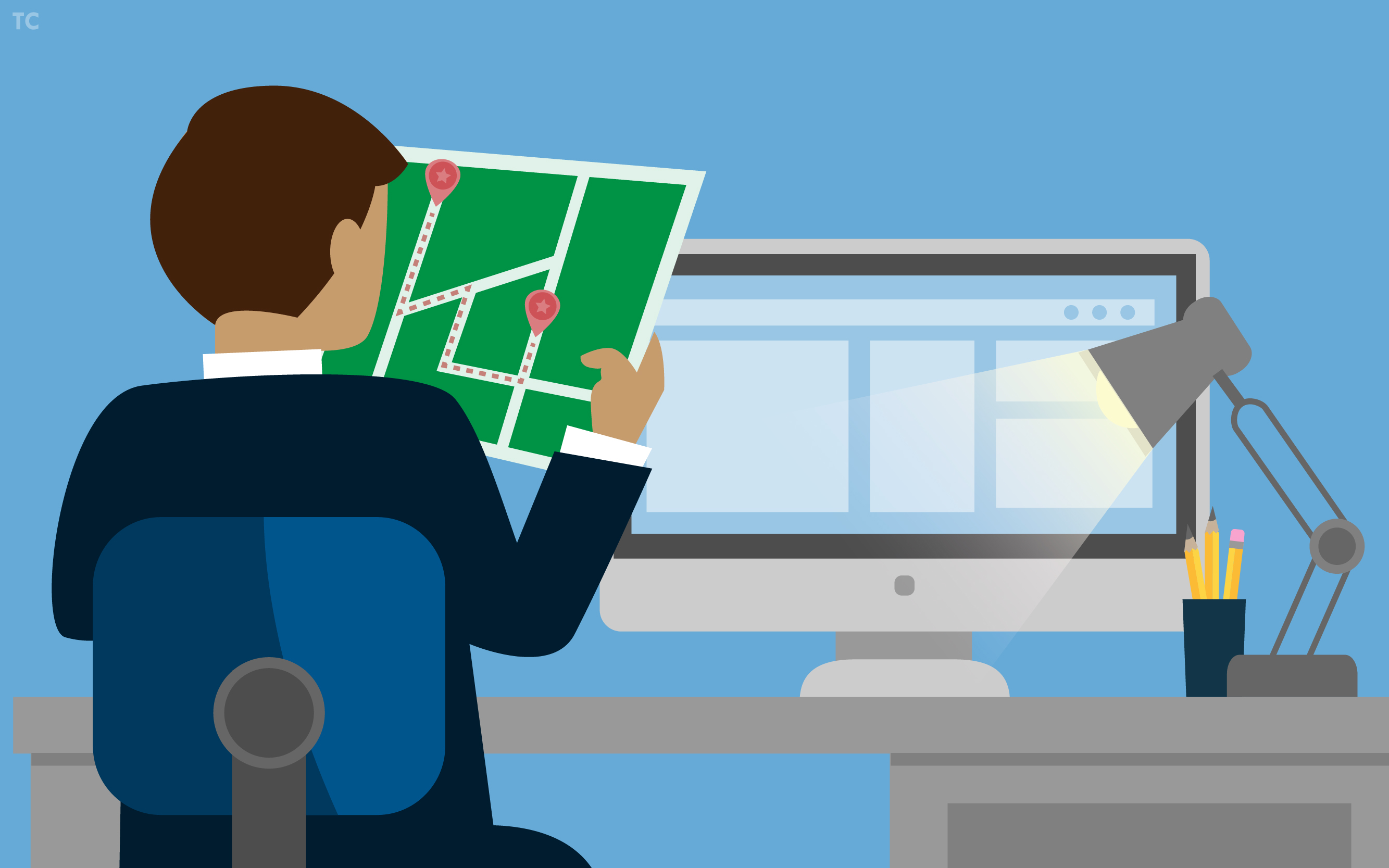
Not everyone is technologically savvy, especially the website goers that are actually spending money, who tend to be older. Even those who are good with the Internet will get frustrated if a website is not easily navigable. The user should be able to intuitively find their way around. If customers can’t find what they need in less than 3 clicks, chances are they’ll click away to a different website. Don’t lose potential shoppers to your competitors because your website is a labyrinth.
4) The 90s Are Calling; They Want Their Website Back
Gradients, Drop Shadows, Bevel and Emboss, Bubble Letters, Comic Sans: all elements that are a thing of the past! It is quite obvious when a website is outdated and is a quick turnoff for web users. Having a website that needed an update 20 years ago will only hold you back. Customers find up-to-date and user-friendly websites trustworthy. Especially if you claim to be an expert in your field, you should prove it with a modern design.
5) My Grandma’s Faster Than The Loading Speed
People’s attention spans are pretty sad and are on average last for about seven seconds. Especially when everyone desires instant gratification, you have mere seconds to impress those visiting your website. Slow load times are inexcusable and could be the result of images that are too large, special add-ons, or Flash animations. You will need to do a little spring cleaning to make sure your website is in great shape to load pages quickly so your user doesn’t lose interest and find a faster website.
6) Conversion Forms That Are Way Too Personal
You want the website user to sign up for your email blast so you have a nifty form for them to fill out. All they need to provide is their name, email, home address, birthday, favorite color, what they like to do in their free time, social security number… Conversion forms, whatever the purpose for them may be, are crucial for converting traffic into leads. But if it takes too long to complete the form and you ask for way too much information you will deter users. Keep it simple and limit that information you are asking as much as possible. Only ask for the information that is absolutely vital.
7) Everyone and Their Mother Is Using Stock Images
People respond to imagery better than text alone so it is a smart move to season your website with pictures, illustrations, and videos. Visual representation can improve website traffic and conversions, but you don’t just want to put up an image just for the fun of it. Any visuals should be used with purpose and you should also be mindful of how much stock photography you utilize. Stock photos can be a quick and easy fix but is not the best way to set yourself apart from the crowd. There are only so many stock photos to choose from and sometimes they end up looking the same or come across as insincere. Stock images are generic (and for a reason; stock image websites want their pictures to appeal to as many scenarios as possible to optimize usage). Investing in an illustrator, designer, or photographer to create a customized image can really set you apart and help to establish a genuine connection with your customers.
8) No Call-To-Action
Call-To-Action buttons or links are very, very important to getting conversions. They prompt immediate action and will drive people to download, subscribe, register, share, buy, or whatever else you tell them to do. The absence of a call-to-action will directly lead to fewer conversions.
9) Stranding a Viewer On a Page
The user is ten pages deep into your website and they now wish to return to the homepage but they can’t because you decided to be a putz and didn’t provide an easy way back. You have essentially stranded the visitor and this creates frustration. Frustration equals the customer giving up all together and finding an easier-to-navigate website. Another scenario is that sometimes users will send a URL to another person, who may visit the link and than may want more information. If the page they are on is a dead end and they can’t find the homepage, than congratulations, you “done goofed”. Always have a link “home” and have your site logo link back to the homepage.
10) Broken Links
Broken links, links that don’t work and/or provide and “error” page, are like opening a bag of tasty potato chips to find that it is just filled with air and empty promises. Broken links negate the point of having a website or web page and are a sign of unprofessionalism in web design. It can ruin your customer’s impression.
11) Website That Isn’t Mobile Friendly
With 60% of all Internet searches being performed on mobile devices, your company website should most definitely be mobile friendly. Especially since Google implemented an algorithm that effects ranking; websites that function on both desktop and mobile screens will rank higher in Google searches than websites that don’t. A website that is not mobile friendly is like running a marathon with weights attached to your legs; it’s a disadvantage that can easily be remedied.
Looking for someone to create or modify a website? Contact CS Designworks and get a quote.

Join Our Blog Community
@CSDesignworks
