The Aftermath of Mobilegeddon
Posted on July 08, 2016
By Theresa Chiechi, Designer, Illustrator, Writer

What do beepers and websites that aren’t mobile friendly have in common? They are both outdated. You wouldn’t choose a pager over an iPhone so why would you continue to let your website fall into the same level of obscurity? In the wake of Mobilegeddon, you’ve had a year and you postponed the inevitable... now there is no excuse. Continuing on this path might just prove to be a death sentence for your website.
In The Age of Mobile Devices
If you are like the majority of adults in the US, you own a smartphone. And if you own that smartphone, you statistically check it about 46 times a day3. With the increasing dependency users have with their phones, it’d be crazy for businesses not to have a mobile-compatible site. With 60% of all Internet searches being performed on mobile devices, if your company’s website does not prove itself mobile friendly, than you can say goodbye to all those potential opportunities1.
The Aftermath of Mobilegeddon
In April of 2015, Google dropped its latest algorithm that favored websites that were mobile friendly. This update was nicknamed “Mobilegeddon” and because of it, 25% of websites without any previous mobile strategy made the smart decision of optimizing for mobile use2. A month after implementation, while some sites saw no change at all, others were losing up to 35% of their mobile search rankings in the top three positions.
Mobilegeddon was hyped to be this catastrophic event, marking the deaths all of those sites that did not change with the times. While the immediate effects of the new algorithm were not as disastrous and condemning as marketers were saying, it was only the beginning and Google is sure to continue to tweak the update so that mobile friendly sites will continually be pushed to the top of Google searches.
What Happens To Websites That Aren’t Mobile Friendly
If you are one of those businesses who’ve resisted the change, perhaps due to lack of time, resources, or understanding of how to make the modification, unfortunately your website won’t show up in the top mobile search results. You’ll constantly be beat out by mobile friendly websites. You might as well just hand over to your competitors the money that you’re losing while your mobile traffic decreases.
The Internet is oversaturated with competition. No matter what business you are in, there are hundreds of others trying to win over the same customers. In a span of 10 years from 1997, the amount of websites went from 1 million to 150 million. With this number of opposition in mind, getting your website to outrank your competition’s is no easy feat, so you must do everything in your power to give your website the best chance at being discovered.
Google is, and has been since 2010, committed to providing a frictionless experience to mobile users. This new algorithm is basically a cheat sheet on how to get your website to rank well; business who comply can easily win traffic which could result in conversions.
Try this Mobile-Friendly Test to see if your website is up to Google’s standards.
Responsive Vs. Adaptive Design: Which is the Best?
The two popular options on how to optimize your website for mobile conversion are Responsive Design and Adaptive Design.
Responsive design is all about flexibility; it works by using one website that can look good on any device, at any size4. As the name suggests, content literally responds to the size of your screen. Web developers place script to determine a visitor’s screen size and the page layout reacts accordingly. Responsive design requires no duplication of content; what you see on the desktop version of the site is the exact same as the elements you see on the mobile version.
Adaptive design, on the other hand, detects the device and other features and then provides the appropriate feature and layout based on a predefined set of viewport sizes and other characteristics4. It uses static layouts based on breakpoints, detects the screen size, and loads the appropriate layout for it.
An easy way to think about the differences is that one changes smoothly and the other snaps into place. Responsive design is smooth because the layout fluidly adjusts regardless of the device while adaptive design snaps into place because the page is serving something different because of the browser or device it is viewed on.
Adaptive allows you to take control of the design and develop for specific, multiple viewports. The number of viewports that you choose to design for is entirely up to you, your company and overall budget. It does afford you a certain amount of control that you won’t have using responsive design.
The majority of new sites now use responsive, which has been made easier for less experienced designers and developers. Responsive doesn’t offer as much control as adaptive, but takes much less work to both build and maintain. Responsive layouts are also fluid and whilst adaptive can and does use percentages to give a more fluid feel when scaling, these can again cause a jump when a window is resized.
Things To Keep in Mind When Optimizing Your Site
Mobile sites should not look identical to your desktop site; the two devices are different and should be optimized for different functions. With limited space on a mobile device, the problem of text size pops up often. Stuffing your page with as much information as possible is not a smart idea for mobile screens. With a tiny screen, putting just the right amount of text and clickable links is crucial. The content of your page should be easily viewed and navigated.
For example, CS Designworks just recently redesigned BCM’s website, updated the overall look and created a website that was also mobile responsive. The picture below shows what a website on mobile shouldn’t look like. The previous BCM site simply shrunk down the desktop version so that it fit on a mobile screen, making everything appear way to small to navigate or click button efficiently.
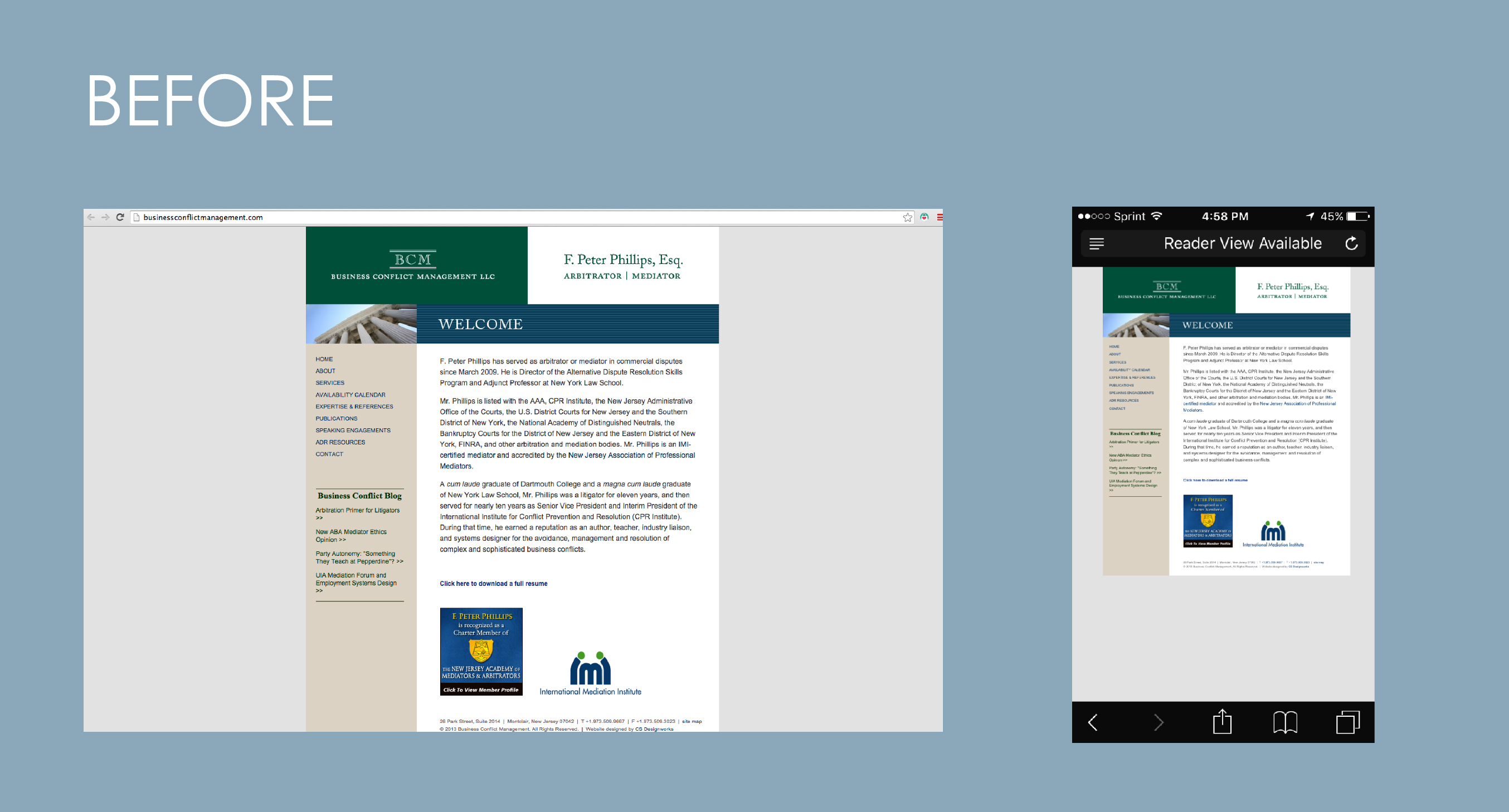
Just to make sure that this website, beyond a shadow of a doubt, was indeed not mobile friendly, we plugged the url into the Google test and the results were dismal. Google scolded the website for the text being too small, links being too close together, mobile viewport not being set, and the content being too wide for the screen. Ouch.
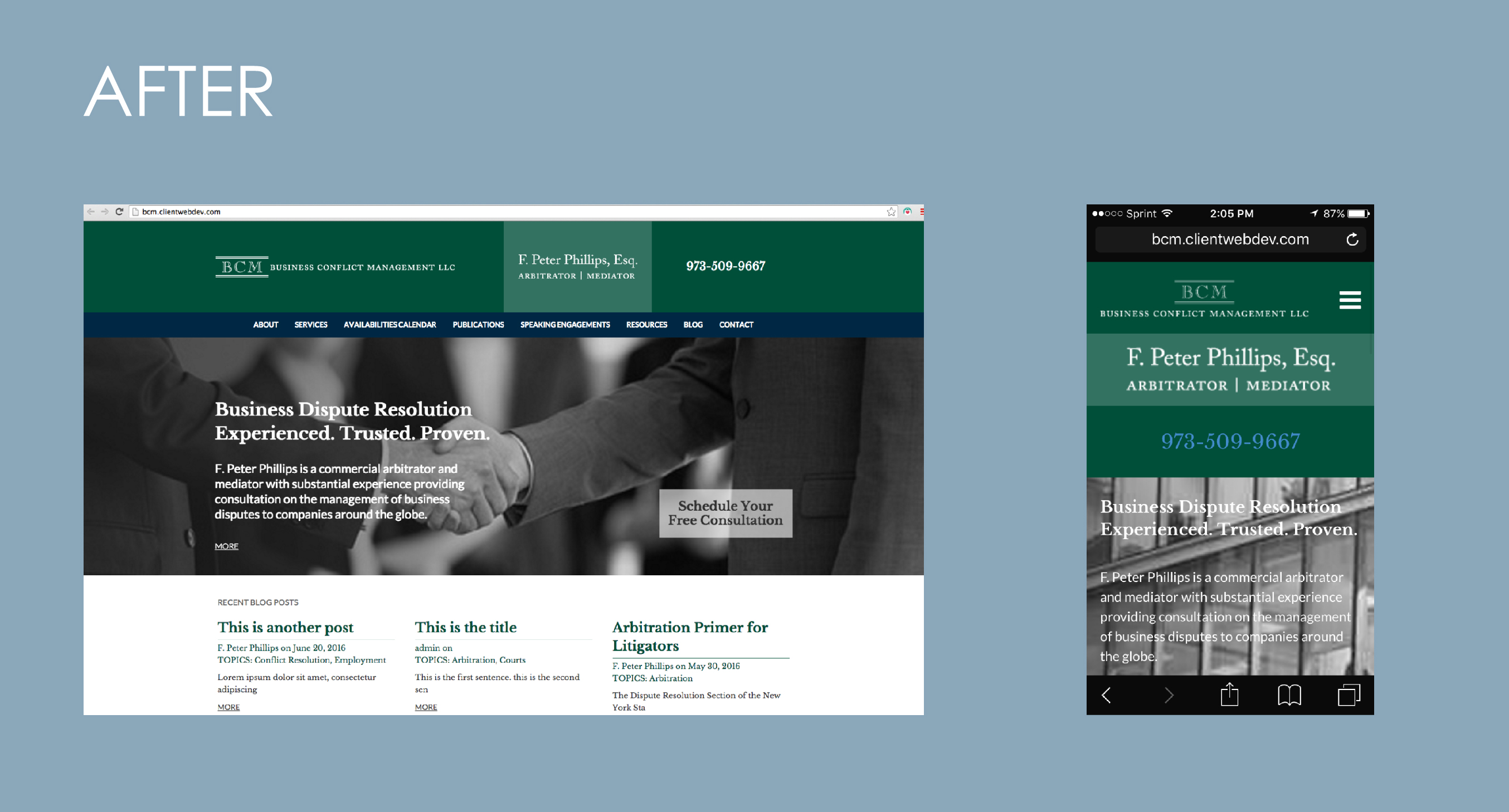
But not to worry, CS Designworks fixed things. With the update, the website now looks like the picture below. As you can see, the site adapts to fit the screen of the phone; things get moved around so that it is easier for the viewer to navigate the website.
Mobile devices are made to be accessible to the user who is on-the-go and sites should be formatted to fit that fast-paced lifestyle. If a website takes too much time to load, then it will quickly lose the Internet of the user visiting. Keeping the page size small enough will ensure that it is loaded quickly on cellular networks.
Loading speed is even more important since there have been rumors circulating that Google is planning yet another update to search result ranking. This entails the possible addition to a red slow tag or a “slow to load” message to call out websites that will eat up too much of the users time. With most people’s attention span averaging to about 7 seconds, you can be quite sure that this update will definitely put a death sentence on a slow website.
Need Help Becoming Mobile Friendly?
Contact CS Designworks. We can help improve your website so that you won’t lose any more precious traffic.
Enjoy our blog articles? Sign up for our newsletter and receive monthly updates and helpful content.
Sources

Join Our Blog Community
@CSDesignworks
