Conversion Centered Design
Posted on September 26, 2016
By Theresa Chiechi, Designer, Illustrator, Writer
 Get A Website That Converts | Conversion-Centered Design.
Remember the days before having a website for your business seemed necessary? In a decade’s time since 1997, the amount of websites on the Internet grew from 1 million to 150 million. Customers expect to be able to find any business they need online. So, should your company have a website; simple question, the answer is without a doubt, “yes”. The not-so-easy to answer question is how do you acquire a website that not only looks nice and is easy for customers to use, but also sets you apart from the competition and guarantees high conversion.
Having a well designed website is one half of the equation; good design helps clarify meaning. With the help of an accomplished graphic designer, you can achieve effective communication with your customers, quickly captivate their attention, establish an identity for your brand, and give an appeal to your service that coerces people into using your company.
An ugly or confusing website can easily deter customers. However, aesthetic is not the only thing that factors into website conversions. Most designers know how to create an appealing website but they don’t think about the other half of the equation; what plays into whether or not someone takes that extra step to purchasing your services or products.
In this article, we’ll break down the basics on how to design a website that converts. What is a conversion? A conversion is the point at which a recipient of a marketing message performs the desired action; simply, it’s when someone responds to your call-to-action6. Opening an email, clicking on a call-to-action link, filling out a form, and purchasing a product or service are all forms of conversions.
So when hiring a designer, they mostly focus on visuals and what looks nice but they aren’t actually designing for conversions. To be blunt, most designers don’t care whether or not you successfully sell your product. CS Designwork’s specializes in conversion-centered design and we’re going to spill the secret to how it works.
The Sparknotes
In short, this is what it takes to give your website the best odds at sealing the deal:
-
You have about 10 seconds to grab a person’s attention. If it takes longer than that to understand your brand and service, the customer will leave.7
-
The more landing pages you have, the more likely you are to get leads.
-
Pages with videos can get your customer to linger on your page two minutes longer than pages without video, leading to more potential purchases. Other visuals, like illustrations, are equally as important.
-
A one second delay in your site speed can result in a 7% reduction in conversions.1
-
The call-to-action link should be obvious and in your face.
-
Use visual hierarchy to guide your customer in the right direction.
What is a Landing Page?
The more research you do, the more you’ll see the term “landing page” pop up. A landing page is a campaign-specific web page that is meant to get your visitors to complete a single action. They are made to get conversions. As opposed to trying to show your customers as much as possible, you’re honing in on a particular goal (whether it’s to subscribe to an emailing list, buy a new featured product, etc.) and being as focused as possible.
When thinking about the pages you want for your website you need to consider it’s purpose and if it’s converting visitors into customers; if not, your best bet may be to do without it.
Setting Yourself Apart From The Crowd
What makes your business special? Why should the visitor commit to purchasing your service? The answer to these questions should be quite visible on your homepage and landing page. Make sure the client knows why they should do business with you and the benefit of doing so.
Call-to-Action
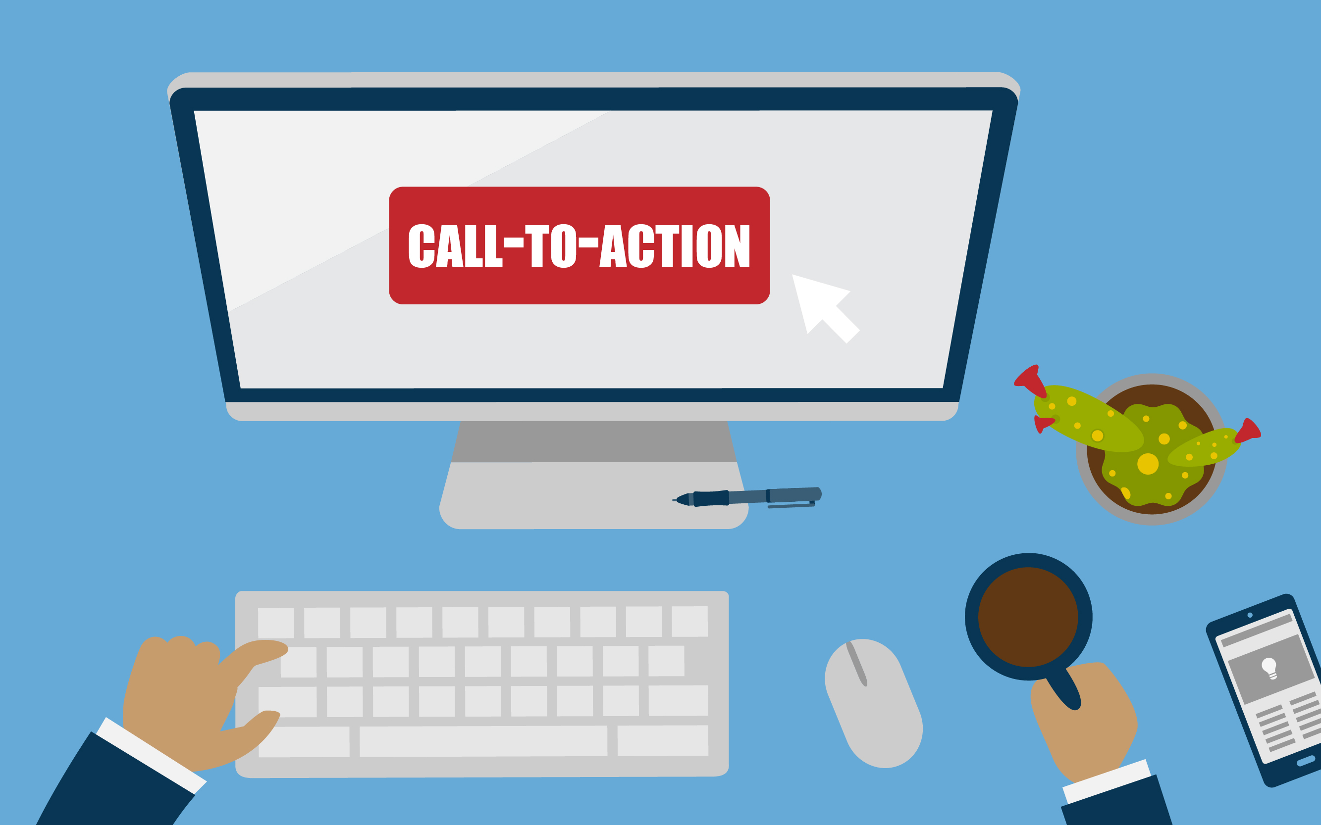
This is another one of those terms you’ve probably heard a lot. Call-to-Actions, usually in the form of a button, tell the visitor what to do next. While simple in theory, choosing whether to say “Buy Now!” or “Purchase” makes a big difference. Wording is important and can, surprisingly, impact the rate of conversions. Testing which phrasing works best is a good idea.
Hubspot wrote an article about a software company, who chose to remain anonymous, that increased their conversions by 105.9% just by tweaking their call-to-action button. Originally the website had the call-to-action link positioned towards the bottom of the page, after a wall text. After moving the link towards the middle of the page, so that the customer instantly saw it without having to scroll down, their conversions increased. Mozilla also increased their conversions just by changing the wording of their call-to-action button; by doing a little experimentation, they found that “Download Now – Free” did better than “try Firefox 3”. The emphasis on the word “free” helped viewers settle on the decision to download.
One good way to make your call-to-action button highly distinguished from the rest of the page elements in to put it in a container or box. This helps allow your visitors clearly identify it within a matter of seconds. If you want to see if your call-to-action button stands out, try the squint test. Squint your eyes or blur your vision and if you can still make out the call-to-action link, you’ve done a fine job2.
The color of your call-to-action will also affect conversion rates. Here are three of the best colors:
-
Red – vibrant, loud, and passionate, this color can really stand out. It implies a sense of urgency, helping your customers make a purchase.
-
Green – Calming and puts your customers at ease, the color is often associated with “Go”…as in “go for the purchase”.
-
Orange or Yellow – Exciting and warm, these colors make customers feel happy. Look to the widely known and used Amazon, for inspiration. The entire site is pasted with yellow and orange.
Obviously, each website has a differed color palette and you should take your scheme into consideration. Perhaps the takeaway is that you want the call-to-action to stick out. Contrast is key.
Avoiding Choice Paralysis
Your service is the bees’ knees and you have so many choices! You’re excited and want to show your visitors absolutely everything you have to offer to them. Unfortunately, giving the visitor too many options can lead to fewer conversions. In a strange phenomenon called “choice paralysis”, the user grows more confused and hesitant the more choices they are given.
It may be hard to resist the urge, but try to limit the amount of options you provide. Make it as easy as possible for people to find the right product. You could also try listing multiple options but highlighting what is the best deal. A default choice could help prevent choice paralysis.
Old vs. New: The Law of Past Experience
What can we say; us humans are creatures of habit. We don’t like change, unless it is something we can’t outwardly detect. Our desire for the familiar influences our purchasing habits and the websites we frequent.
Why is the younger generation so great with technology? It’s because they know the “rules” and recognize patterns that are repeated from desktop computers, smartphones, and video games. The “play” button usually looks like a triangle, the “pause” button looks like two parallel lines, and menu expansions (called hamburgers) are three horizontal lines. With the ability to pick up the patterns, people are more willing to explore a website or commit to a purchase.
For example, e-commerce retailer, Fab.com decided to fiddle with their call-to-action button. The “add to cart” button they ultimately ended up with was able to increase their conversions 49%.
They tried two different buttons; one button was a well-designed cart icon and the other was a button with the words “add to cart” in it. Which one do you think did better?
While the cart icon was well designed and looked cute and clever, the text button increased clicks nearly 50%. The reason for this is because based on decades of online shopping, “Add to Cart” is almost always faithfully plastered to the check out buttons. It’s familiar and there is no confusion as to what will happen when we click the button.
There is a time and a place to change the status quo, but sometimes you got to stick with the classics. Why fix something that’s not broken?
Clear Visual Hierarchy
Every designer worth his (or her) salt knows this term. Visual hierarchy, or the arrangement of elements in a way that establishes importance, influences the order the human eye perceives what it’s looking at. You’ll want to make sure the visual hierarchy of your website clearly points to the call-to-action button (or whatever goal you want to reach on the page).
A well-placed conversion form or call-to-action button can be the difference between conversions. A good layout should be designed to set visitors for maximum conversions.
My Friend Told Me To Do It
The most credible form of advertising comes from the people we know. 92% of online respondents said they trust their friends and family recommendations. The next top trusted source was online consumer opinions, at 70%. Word-of-mouth is so incredibly important in this day in age and can influence purchases up to 50%.
By putting elements of trust on a landing page, you can back up your claims and reassure your visitors that your business is right for them. Adding testimonials to your page, in an appropriate visual hierarchy that prompts visitors to actually read them, can do wonders for your site.
Social media is a great way to show reviews about your services. Facebook, LinkedIn, and Google + all have reviewing features that can validate your company’s credentials.
Visible Social Media And Contact Info
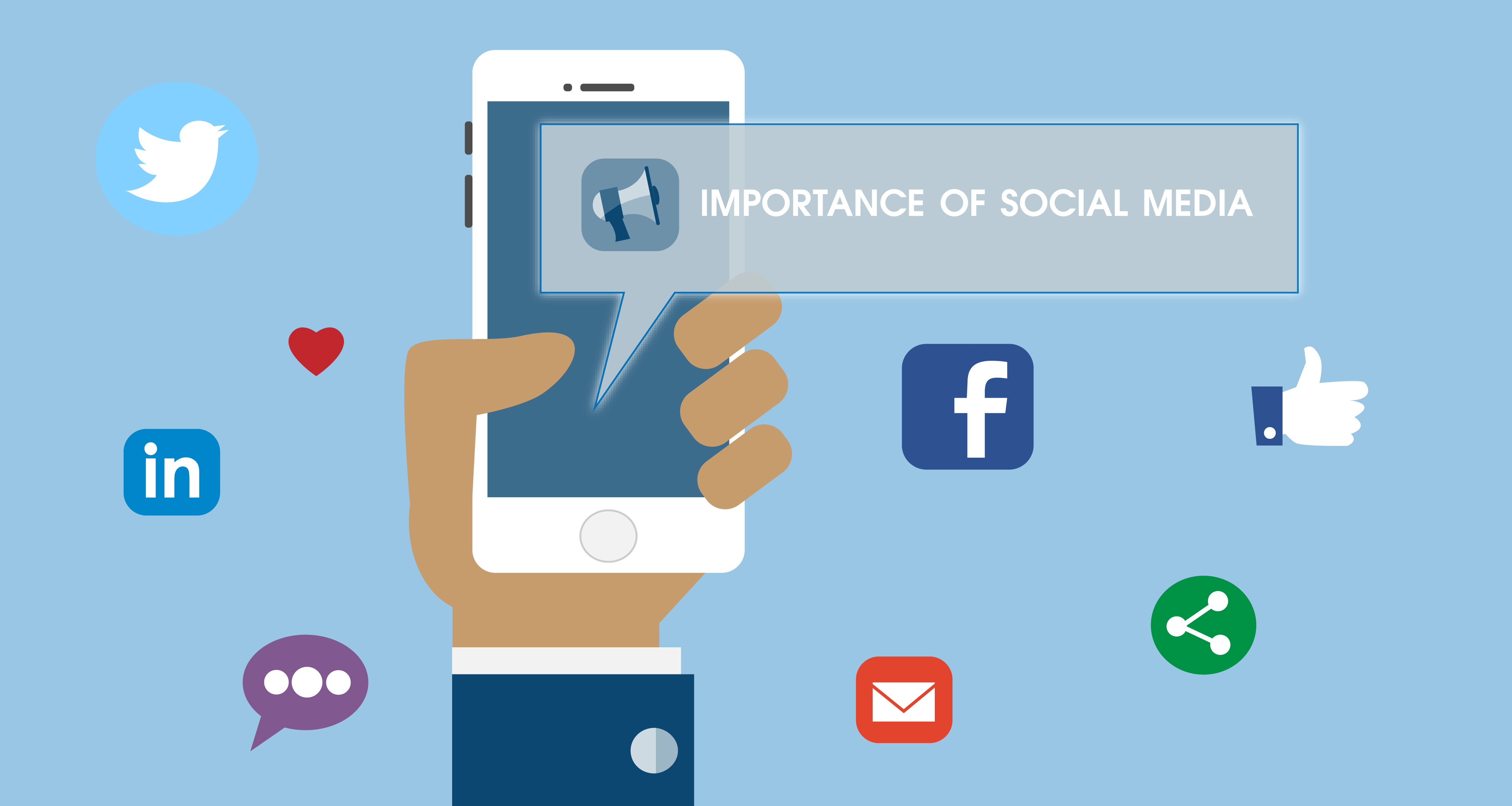
Everybody and their mom seem to be on social media today. Social media is so prevalent today for a reason; we love feeling connected. Through social media we can converse, make new connections, and open the doors for endless possibilities. It is in your company’s best interest to be on social media and interact with your customers. It’s also equally important to make sure your social media accounts are all connected to and visible on your website. People trust businesses that are on social media, so having the icons visible on your website help people trust your company more. Additionally, if you have the icons in a visible spot it makes visitors more likely to share your content to their social media.
It’s equally as important to have your general contact info visible. Make sure your email, phone number, and other contact options are listed on every page. LessAccounting saw a 1.8% increase in conversions just after placing their number on their website.5
Visuals
Visual content, like illustrations and videos, has always proven to be the best medium in which to appeal to your audience. As visual creatures, we react to and retain pictures and videos far better than just text alone. Our reptile brains process images hundreds of times faster than text and this is really important when the average attention span of a person is only 7 seconds. Think back to your last shopping experience; what product were you more likely to buy, one with or without a picture? A visual representation can be the deciding factor to whether your client buys whatever you’re selling, whether it’s an actual product or just an idea. It’s true for social media as well; posts with visual representation are more likely to be interacted with and shared.
Loading Speeds
Back to our sad, pathetic goldfish brains, that on average have very short attention spans, how fast your website loads is extremely important. You’ll see different statistics on how many seconds one has to grab the visitor’s attention and whether it’s 8 seconds, 10 seconds, or 30 seconds, know that it is a very short amount of time! Slow websites will cause frustration and a new visitor will not hesitate to leave if your website does not perform. Slow site = low conversions.
The all-knowing Google knows that speedy sites lead to higher conversions and they even include site speed as a ranking factor. If you want to know if your website passes the speed test, check out Google’s PageSpeed Insights.
All of this information can be a lot to handle. Getting conversions is a delicate dance that takes a lot of trial-and-error, time, and resources. One tactic may work for one website but not for yours. You’ll never know until you play around a little bit.
When updating or designing your website choose a designer that cares about your conversions. Contact CS Designworks for a quote.
Sources
- https://blog.kissmetrics.com/what-converting-websites-do/
- https://vwo.com/blog/design-principles-increase-conversions/
- https://blog.kissmetrics.com/psychological-principles-converting-website/
- http://webdesign.tutsplus.com/articles/how-to-become-a-conversion-centered-designer--cms-19664
- http://conversionxl.com/how-to-design-a-home-page-that-converts/
- http://sherpablog.marketingsherpa.com/marketing/conversion-defined/
- https://www.nngroup.com/articles/how-long-do-users-stay-on-web-pages/
- https://www.aabacosmallbusiness.com/advisor/truth-best-worst-call-action-button-colors-website-212506540.html

Join Our Blog Community
@CSDesignworks
